Journal’s logo

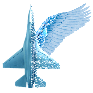
The logo of the journal “Ontology of Designing” is the image that embodies the relationship of natural and artificial.
A bird wing, an important element of a biological object, represents nature, and as an artificial object an airplane was taken. Both of these disparate objects use aerodynamic principle of flight. In this image the bird’s wing is not a soaring wing, and not a wing at the end of a flap, when the “air” is discarded, and the bird flies by inertia. This position is at the moment of a wing flap as a hand of a swimmer thrown forward, it is the first phase of the flapping motion, the very beginning of the flight. These two human-made and natural objects are compounded together: at the joint their inner substance is exposed, which is pictured here as a conventional honey comb or cellular structure that shows certain internal similarities of these objects.
The choice of these “aviation” symbols was supported by many members of the Editorial Board as it is close to them as the subject of a research. Nevertheless, it of course does not reflect the full range of the subjects of designing which to be studied and discussed on the pages of our journal. Contemporary designing takes its knowledge from the creations of nature. Ontology of the process of designing the future brings us back to the existing and already created being…
The hybrid of an aircraft and a bird’s wing in the picture resembles a burning torch, where the fuselage is its handle, the plane’s wing is a bowl, and the wing of a bird is a blazing fire. The creative fire of knowledge like the beam will illuminate the path to the truth, to the mysteries of the universe…
Professor Alexander I. Danilin using the first letters of the journal’s title (in the Russian transcription), gave a few concise definitions, which reflect the essence of the publication, thereby extending its semantics: Ontology of Designing is
the Experience of Professionals,
the Discussion of Problems,
the Explanation of Paradoxes,
Understanding Nature,
Obstacle Avoidance,
Education of Designers.
Continuing these brief metaphors it is possible to add the purpose of the journal, that is Space Optimization.
Unfortunately, all this could not find a nice match in English.
